
When you designed your website, chances are you didn’t give enough thought to the design of your contact page.
In fact, it should be the clearest, most easily accessible and visually appealing part for two reasons: It’s often the most-visited page, and it reflects greatly on how your company is perceived.
In a 2014 study by the Content Marketing Institute, 55 percent of respondents said not having contact info online reduces vendor credibility, while 37 percent said it wastes their time. Most also said they’ve left a site due to a lack of contact info.
“That’s between one-third and one-half of potential buyers leaving, never to return,” said Diana Huff of Huff Industrial Marketing. “While marketing collateral is key with regard to establishing credibility, so is contact information.”
Might it be time to rethink your contact page design? Here are aspects to consider.
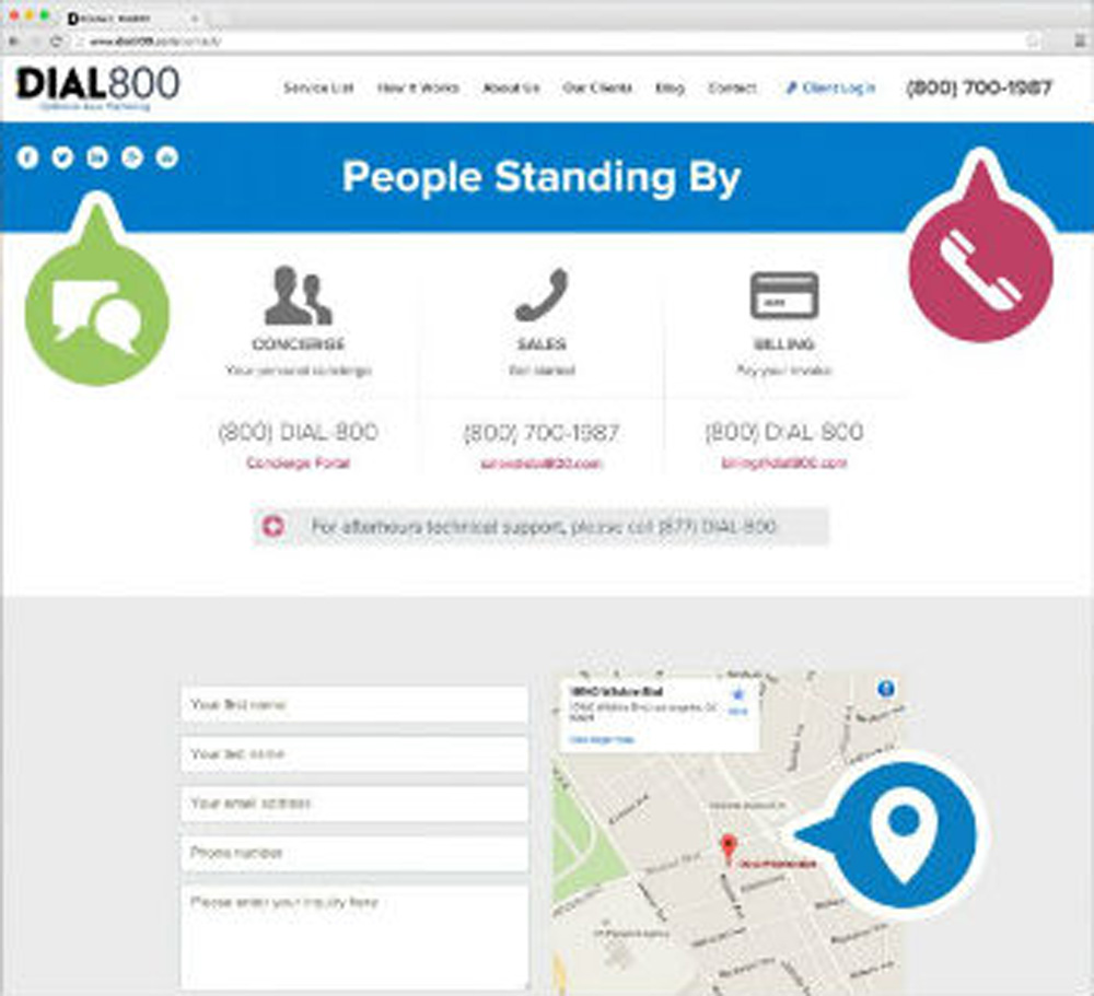
- Make the call to action on your page obvious, engaging and brief. Why should users contact you, and how should they do that?
- Make your phone number huge and impossible to miss. In fact, consider adding it to other website pages as well.
- Requesting too much contact info from the user can be a huge turn-off, especially initially. In research by Dan Zarrella at HubSpot, for example, conversion rates improved by almost half when form fields dropped from four to three. Make the forms ridiculously easy to use, avoiding unnecessary mandates and format requirements.
- Be clear that user info won’t be shared elsewhere.
- Incorporate links to your social media for those wanting further info.
- Ensure the load time is no longer than 3 seconds (after that users typically give up, according to Instantshift.com).
- Use impeccable design that’s not visually overwhelming. “(With) a poorly designed page, people won’t be interested in establishing further relations,” writes Calvin Sellers on Instantshift.com. He pointed to a 2012 study in which 94 percent of respondents said design lessened their trust in a certain website.
- Use relevant, high-definition imagery. Creativity appeals; for example, travel agencies could make their form a postcard, antique stores an old typewriter. But stock photos can contribute to distrust of your company.
- Ensure your page design matches your brand. Don’t be afraid to show personality and humor.
- Include a map to concisely show your physical location. Aerial maps are a trend.
- Maximize intelligence from incoming calls with software like Dial800’s CallView360, which records and times calls, tracks sources and conversions, and then compiles cost per call, cost per lead and ROI.
- Ensure your page works well on all mobile devices; if not, create a separate mobile page.
- Be vigilant about broken links, grammatical errors or typos that could deflect new trade.
Finally, as part of the leveraging of your contact page, build a company culture that welcomes phone calls even if they don’t lead to sales.
“Our call center and the telephone (are among) the best branding devices out there,” commented Zappos Inc. CEO Tony Hsieh at the Inc.5000 conference in October. “Most (live) calls actually don’t result in an order the first time, (but) average customer lifetime value is actually five to six times higher. We have the customer’s undivided attention for 5 to 10 minutes … if we get that interaction right, they remember us for a very long time, and they tell their friends and family about it.
“We try to think … how do we come up with other excuses for customers to contact us?”
 CallView360®
 VoiceInsights AI
 AccuRoute®
 BizCloud
 RapidRecall®
 Integrations